University Project
TeamSport App UI Redesign Prototype
As part of a university project, I redesigned the app of TeamSport- the UK’s largest indoor go-karting company. This included taking weak elements of the current app, and improving on them, as well as adding new ideas of my own. Below are the Figma links:
Wireframes – https://www.figma.com/file/KUtfwEzJN3vDym7887ojIx/TeamSport-App-Wireframes?type=design&node-id=0%3A1&mode=design&t=ti5dTwxQT8wpy7Wz-1
Final design – https://www.figma.com/design/prNWOeTiwJHv3zyCS2WNiH/TeamSport-App-Prototype?node-id=0-1&t=dBGAECEVLOZzyl8u-1
Working prototype – https://www.figma.com/proto/prNWOeTiwJHv3zyCS2WNiH/TeamSport-App-Prototype?node-id=5-165&p=f&t=fZbyPKEOcAP6neul-0&scaling=min-zoom&content-scaling=fixed&page-id=0%3A1&starting-point-node-id=5%3A165&show-proto-sidebar=1
Project Breakdown
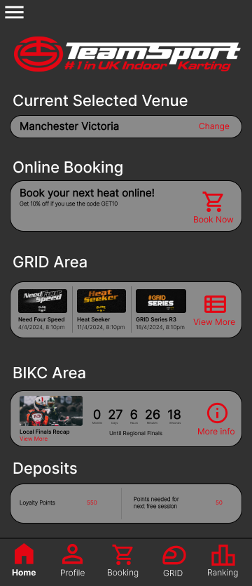
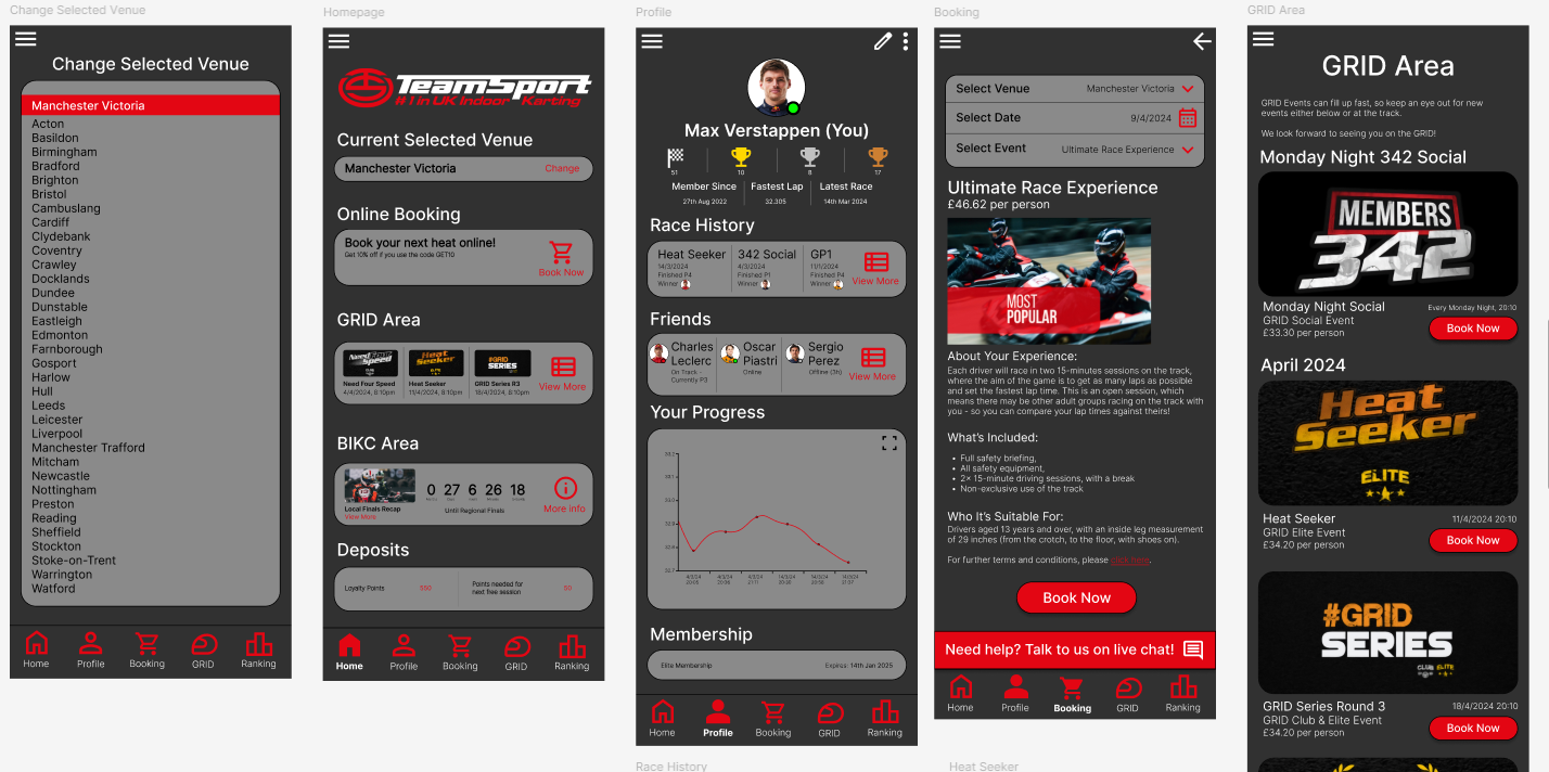
Homepage
For the homepage, I wanted to show information for some of the features/aspects of the app. Arguably the most important aspect is at the top – changing the venue that the user is at, as they don’t want to book a session at the wrong venue accidentally. The rest of the aspects are in order of how important they are in my opinion. As this app has mainly been designed for the members, the member specific events are listed here.
The deposits part is a system that TeamSport have that give customers loyalty points for racing, which they can use to book a race for free. Their current app does not show how many points are needed for this, which I think is an important thing to include.

Profile page
For the profile page, I wanted the user to see race history and a list of their friends – a feature that I decided to implement. There is also a progress graph which is on the official app, however I have altered the design.
There is also an online status for each driver. Green = online, grey = offline, and red = currently on track.
I have also made a couple of profiles for different drivers which all look a little bit different. For example, Charles Leclerc is currently on track, so going on his profile, I would be able to see live race statistics. These can be found on the Figma link.
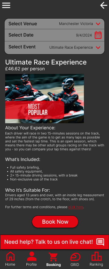
Booking page
For the bookings page, I realised that I needed to include the same session information, so I took the text from the official app and put it into my app. The official app’s booking section has a completely different UI to the rest of the app, which is a huge downside to using it. So I needed to make sure this page layout had the same structure as the previous pages I had created.
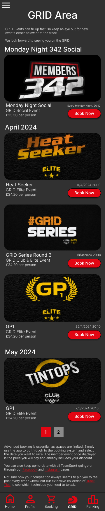
GRID Area
The GRID Area is the members’ part of the app, where users can book a range of different session types exclusive to members. The current design on the official app is messy in my opinion, and doesn’t have much structure. This is the main thing I wanted to change for my app design.
The main changes I made include: making the images larger, adding a ‘book now’ button, centre-aligning the images, and adding in a multiple page function.

Ranking page
For the ranking/leaderboard page, I wanted to add a search function, and I also wanted to give the user the ability to look at everyone’s times. This is something that the current app does not have, and only features the top 10.
I also added the ability to add drivers as friends if they are not added already. The filter at the top is more simplified and has been made bigger compared to the current app.
