University Project
TeamSport Manchester Victoria video adverts
As part of a module in final year of university, I created a set of video adverts for TeamSport – the UK’s largest indoor karting company. These adverts contained both off and on-board footage provided by me, including a video sent to me by a member of staff. I made four different variations of the advert – 2x 1 minute-long videos, one landscape and one portrait, and 2x 20 second videos, again one landscape and one portrait.
Long Landscape
Long Portrait
Short Landscape
Short Portrait
Project Breakdown
Going into this project, I knew one of the main things I wanted to achieve was to sync video cuts to the beats of the music I was using. The first thing I did was, for the long version of the advert, take the audio track I was using and edited it from its original length of 3 minutes, 4 seconds, to just under a minute long.
After sorting some audio edits out, I started adding in pieces of footage. I cut each clip perfectly on the beat, and to where I thought would be a good point, so none of the clips go on for too long. I wanted to primarily have clips from the spectator area with different angles, with some onboard footage sprinkled in, so I made sure to do this. I made sure that the specific part of each clip I was including had one or more karts in – as a lot of the footage is waiting for karts to come round to a specific part of the track. Additionally, for the onboard footage, I made sure to include a part where I, the driver, was close to another kart and not just on my own. In two of the clips, I am overtaking someone, and decided to include this in the hopes that it grabs the viewer’s attention.
To add to all the footage I had provided myself, I had been sent some pictures and a video by a member of the staff at TeamSport’s Manchester Victoria venue. The video in question was taken from the trackside, in a spot where only staff could access so it was a different angle I could use. However, there was a problem with this particular video when it came to the landscape version of the advert. It was taken in portrait, rather than landscape, and wasn’t the best of quality. I did attempt to scale the video up to match the 16:9 aspect ratio, however this resulted in a bad video quality. After attempting to just put the singular video on its own, I found that it looked unprofessional. Instead, I duplicated the video twice and put them all side-by-side, resulting in the entire frame been taken up by the three videos. This looked better, but I still thought it could be improved upon. So, I decided to be a little more creative. For each of these three videos, I shifted the part that was shown. However, I made sure to show different parts for the three different versions of the video. So, the video on the left was 2-4 seconds, the middle was 5-7 seconds, and the right was 9-11 seconds. I did this so it didn’t just seem like a duplication of the same piece of footage. Furthermore, I made sure that the middle clip was the best part of the video, meaning the most karts were shown in that specific part. I did this because the viewer’s attention would most likely be in the middle of the frame, so it’s always a good idea to put the most attention-grabbing part here.
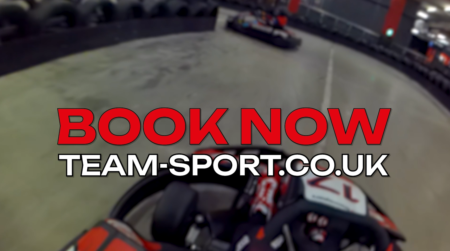
After adding in all the clips necessary, which posed a couple of challenges but was mainly trial and error, I wanted to add in some text with important information. After researching TeamSport’s stylistic choices in their current video adverts, I decided I should stick to their branding colours for the text, these were red, black, and white. The first thing I did was, using Photoshop I took the TeamSport logo, and changed the ‘TeamSport’ text from black to white, as this would not only look better overlayed on top of the footage, but would also work better in the type of logo animation I had in mind, as I wanted to have a black background for it. After altering the logo, I added this into Premiere Pro along with some text underneath that reads ‘Manchester Victoria’. I then started adding in other pieces of text into the video to display information about the venue. I started with a statistic about the track length, and put the number in a large font size in red, and added ‘multi-level track’ text in white underneath. I also wanted to make sure that the width of these two pieces of text were the same – this is a stylistic choice I have used in previous projects, which have worked well, so I know it can look good.
After completing this process for the rest of the text that was added in, I thought it could do with a bit of animation. After a little bit of research, I realised I didn’t want anything too distracting, and went with something simple, yet effective. I decided to make the text flicker between two different fonts. The two fonts I went for were Unbounded and Heavitas. After this process was completed for all the pieces of text I made, I started doing some research into logo animations, and came across a dynamic zoom type animation tutorial on YouTube (https://www.youtube.com/watch?v=c30CY-zYkP0). The animation included using the virtual camera inside After Effects, which was the main component to make the animation work. I haven’t had much experience with the After Effects camera, so this tutorial allowed me to gain experience and confidence when using it. The animation also included using CC Light Sweep and Optics Compensation, and even featured the Shift Channels effect to create the shift in the red, green and blue colour channels.
I followed this tutorial perfectly, and after it was rendered out, I put it into my Premiere Pro project. I made sure to time the animation so the whole logo appears when the screen cuts to black. After this, all there was left to do was render it, before I started on the long portrait version. The portrait version was very simple to make, I simply changed the frame size from 1920×1080 pixels to 1080×1920 pixels which is mobile size. I had to slightly scale up all the text, and as for the portrait videos that were side by side – I simply removed the left and right and kept the middle video. I also scaled up each of the landscape videos to fit the frame, which admittedly cropped a lot of the videos out, however to counter this, I altered the videos’ X-axis position where necessary, in order to show the action.
I then started on the short video and began with more edits on the audio in order to trim it. The main thing I had to do was decide specifically which clips and what text was to be included, as the length had been significantly reduced. I decided to keep the logo & ‘Manchester Victoria’, the prices of the Ultimate Race Experience & Student Experience, the location and ‘book now’. As for the footage, I decided to remove any footage that wasn’t of the karting as that’s what is best for getting and maintaining viewer attention and made sure to include both off and on-board footage. When this was complete, I went through the simple process of transforming it into a portrait video, which didn’t take long. It was after this that all four variations of the advert were complete.
